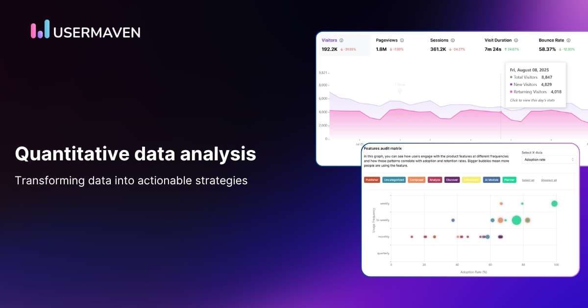
Ever felt overwhelmed by numbers? You’re not alone.
For many, diving into quantitative data can feel like trying to read a foreign language. It’s packed with graphs, percentages, and seemingly endless rows of figures, and let’s be honest, it can get a bit… intimidating.
But here’s the thing: it doesn’t have to be.
Once you understand how to break it down, quantitative data analysis becomes a powerful tool to unlock actionable insights that drive decisions and growth.
Let’s make it simple, together.
What is quantitative data?
Quantitative data is information that can be measured and expressed numerically. Think of it as the kind of data that tells you how much, how many, or how often.
Instead of vague guesses, you get concrete answers backed by real numbers, whether it’s sales performance, campaign analytics, or product engagement. Quantitative data analysis takes this raw data and transforms it into insights, helping you understand patterns and trends that guide your business decisions.
The beauty of quantitative data is that it doesn’t play favorites. It’s objective, consistent, and (when used right) incredibly powerful. From conversion rates to churn percentages, these numbers are your reality check and your opportunity.
Quantitative data examples in SaaS and marketing
For SaaS businesses, quantitative data analysis is crucial in understanding user behavior, tracking campaign performance, and optimizing strategies. It helps you identify what’s working and where improvements are needed, giving you a solid foundation to drive growth.
So, what does quantitative data actually look like in action?
It’s not just numbers on a screen; it’s the measurable proof of how your product, website, or business is performing. Here are some examples of quantitative data you’ll often come across:
Website traffic: How many people visited your site over a given period? It gives you a clear sense of your reach and how much visibility your brand or content is generating online.
Sign-ups per month: See how many new users are joining your product over time. It’s a straightforward indicator of user interest and how effectively you’re attracting new audiences.
Active users (DAU/MAU): Track how engaged your users are. If your daily or monthly active user count is growing, it’s a strong sign your product is becoming part of people’s routines.
Bounce rate: The percentage of visitors who leave after viewing just one page. A high bounce rate might signal that your landing page isn’t delivering what visitors expect.
Scroll depth: How far down users scroll on your web pages. It’s a subtle but powerful way to gauge engagement with your content.
Retention rate: The percentage of users who keep coming back. A rising retention rate means people are finding lasting value in what you offer.
Conversion rate: The percentage of visitors who take a desired action like signing up, subscribing, or purchasing. It’s your most precise measure of persuasion.
Lead source tracking: Knowing where your leads are coming from (social, email, search, etc.) helps you see which channels truly drive results.
Ecommerce KPIs: Metrics such as cart abandonment rate, average order value, and purchase frequency show how effectively your sales funnel converts interest into action.
Annual revenue growth rate: A big-picture metric that shows whether your business is actually growing year over year and by how much.
Unlock insights that drive growth
*No credit card required
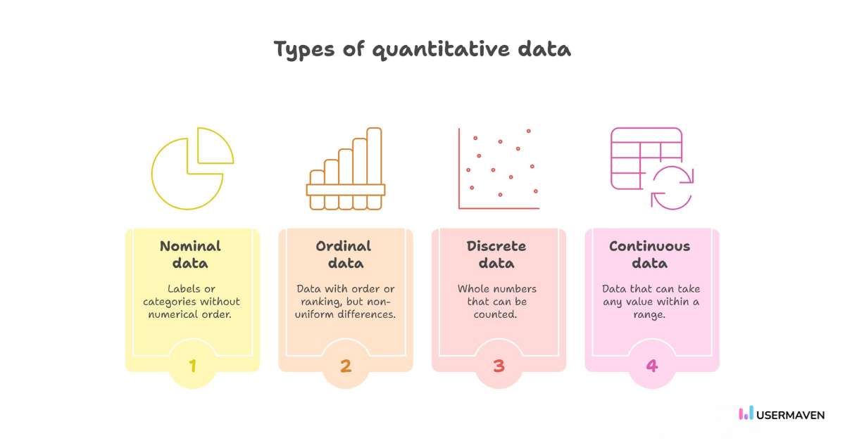
Types of quantitative data
Here’s the thing about quantitative data: not all numbers tell the same kind of story.
Every dataset you collect tells a story, but the type of data you’re looking at determines how that story unfolds.
Let’s break it down.
Nominal data: These are labels or categories without any numerical order. Think of user sign-up sources like “Organic,” “Paid,” or “Referral.” You can count how many fall into each category, but one isn’t “greater” than the other; it’s just different.
Ordinal data: Here, the data has an order or ranking, but the differences between levels aren’t uniform. For instance, customer satisfaction ratings like Satisfied, Neutral, or Unsatisfied. You know one is higher than the other, but you can’t measure how much higher.
Discrete data: These are whole numbers you can count. For example, the number of new users who signed up this week or the number of sessions per user. You can’t have half a sign-up; it’s either there or it’s not.
Continuous data: This type of data can take on any value within a range. Think of metrics like session duration, time spent on a page, or average order value. These measurements can be precise and often reveal more about behavioral trends.
Each type plays its own role in telling your product’s story. When you know what kind of data you’re working with, you can choose the right methods to visualize, analyze, and act on it, without getting lost in the numbers.
Benefits of using quantitative data analysis for growth
Data on its own is just numbers. It’s what you do with it that actually creates impact.
Quantitative data analysis gives you the clarity and confidence to make smarter, faster, and more objective decisions.
Here’s how it helps.
Drives informed decision-making
Numbers don’t play favorites. Quantitative data analysis strips away opinions and assumptions, letting you base decisions on facts rather than feelings.
Whether it’s testing a new feature, refining your pricing model, or prioritizing product updates, you’ll always have evidence guiding your choices.
Identifies trends and patterns
The power of quantitative data analysis is in its ability to show you what’s happening over time. By analyzing trends and patterns, you can see emerging behaviors that may not be obvious at first glance.
For instance, you may notice that user engagement spikes at certain times of the day or that a particular feature drives conversions. Understanding these trends allows you to make proactive decisions, like optimizing your product during peak usage hours or refining your marketing strategy around popular features.
Boosts objectivity
It’s easy to let opinions or emotions cloud your judgment. But quantitative data analysis cuts through all that noise. It’s all about facts and figures, giving you an objective view of what’s really happening.
Instead of relying on gut feelings or team biases, you can look at cold, hard numbers to guide your decisions. This helps eliminate subjective assumptions and ensures your strategies are grounded in reality, leading to more effective, data-driven decisions.
Enhances predictive power
What’s better than knowing what’s happening right now? Knowing what’s likely to happen next.
By analyzing your data, you can spot emerging patterns that help you predict future outcomes. For example, if your churn rate spikes in certain months, you can plan retention marketing strategies. Or if you notice a steady rise in customer acquisition, you can predict future revenue growth.
If AI is part of your roadmap, solid data management keeps those forecasts grounded in clean, consistent inputs rather than messy signals.
Quantitative data analysis helps you not only react to the present but also forecast what’s coming down the pipeline.
Improves strategic alignment
When your team is all looking at the same data, it creates alignment. Instead of making decisions based on different perspectives or “gut feelings,” everyone’s on the same page with the same set of numbers.
This alignment helps you avoid silos, ensures that everyone’s pulling in the same direction, and makes it easier to set clear, measurable goals. Whether it’s product development, marketing, or leadership, data ensures that everyone moves forward with a cohesive go-to-market strategy.
Challenges of quantitative data analysis in business
While quantitative data can work wonders, it’s not all smooth sailing. Like anything, it comes with a few drawbacks.
Let’s take a look at a few of the challenges you might face when relying too heavily on numbers.
Lacks contextual insight
Numbers are great for tracking what’s happening, but they don’t always tell you why. Sometimes, they oversimplify complex issues.
For example, a drop in engagement is easy to spot, but without context or more profound insights, you’re left guessing the cause. You need qualitative data to really understand the story behind the numbers.
Enhances the risk of data paralysis
When you have too much data at your fingertips, it can be overwhelming.
Instead of helping you make decisions, it can actually make it harder to choose a clear path. This is where data paralysis sets in: you’ve got all the numbers in front of you, but you’re stuck trying to analyze every single one, without ever taking action.
Requires a large sample size
For quantitative data analysis to be truly reliable, you often need a substantial sample size. Small datasets can lead to skewed results, making it harder to draw accurate conclusions.
Without enough data, even meaningful trends can get lost in the noise, and you risk making decisions based on incomplete or unrepresentative information.
How Usermaven simplifies quantitative data analysis
Data is only as powerful as your ability to use it. Sure, you’ve got numbers, but turning them into meaningful insights? That’s where Usermaven shines.
With Usermaven, quantitative data analysis becomes a strategic advantage. By providing clear, real-time insights, it empowers you to make informed decisions that drive growth and improve performance.
Here’s how Usermaven helps you make the most of your quantitative data.
Track user actions with event tracking
Tracking user actions doesn’t need to be complicated. Usermaven’s event tracking lets you capture and analyze critical user behaviors in real time, enabling seamless quantitative data analysis without coding.
Want to track button clicks, sign-ups, or feature engagement? Simply set it up in a few clicks, and begin analyzing the data immediately. This means you can gather insights quickly, empowering you to make decisions based on real-time data without waiting for developers or complex integrations.
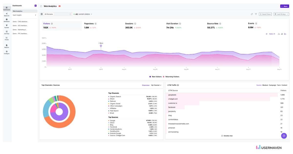
Customize your dashboards for what matters most
Every business has its own set of priorities. With customizable dashboards, you get a tailored view of the metrics that matter most to your business.
By consolidating critical insights such as website traffic, feature adoption, user engagement, and conversion rates, you get a comprehensive view of your quantitative data in one place. This allows for informed decision-making, giving you clarity and focus on what really matters.
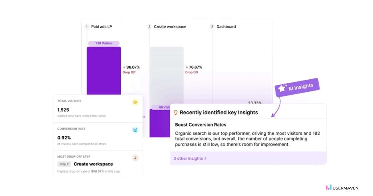
Identify drop-offs with funnel analysis
Understanding how users progress through your product is crucial for optimizing conversions. With funnel analysis, you gain a detailed view of user behavior as they move through each step of your product’s journey.
From first interaction to final conversion, Usermaven shows where users are dropping off, hesitating, or engaging most. By pinpointing these friction points, quantitative data analysis helps improve the customer journey, boost conversions, and drive more users to their goals.
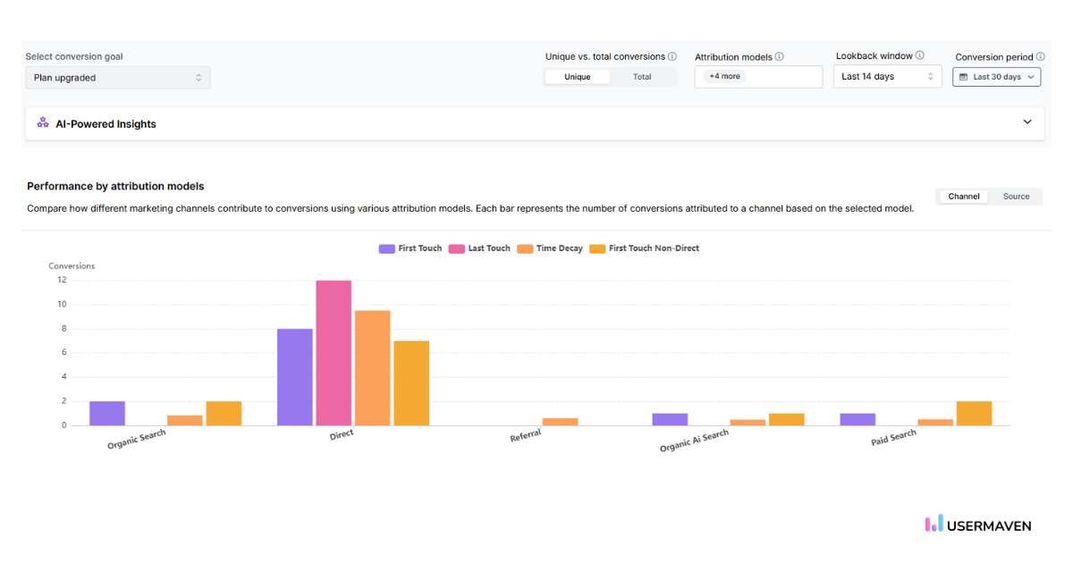
Understand marketing impact with attribution
Marketing strategies are only as effective as the data behind them, and that’s where attribution comes in. Attribution is about understanding which marketing channels and touchpoints drive real conversions, whether it’s paid ads, email campaigns, or organic traffic.
With Usermaven’s seven attribution models, you can track exactly how each touchpoint influences a user’s decision to convert. For teams using quantitative data to measure campaign impact, Usermaven works as marketing attribution software that connects channels, touchpoints, conversions, and revenue, so you can pinpoint which marketing efforts are most effective and worth scaling.
With Usermaven’s seven attribution models, you can track exactly how each touchpoint influences a user’s decision to convert. By analyzing the quantitative data behind each touchpoint, you can pinpoint which marketing efforts are most effective and worth scaling.
No more guesswork about which channels are driving results. You’ll get clear, actionable insights to optimize your marketing spend and focus on what matters most.
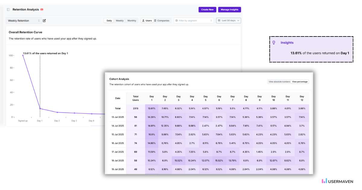
Track long-term behavior with cohort analysis
Not all users are the same, and cohort analysis lets you see how specific groups of users behave over time. By grouping users by factors such as sign-up date or the first feature they used, Usermaven enables you to track retention, engagement, and product adoption across different cohorts.
By analyzing this quantitative data across cohorts, you can pinpoint which user segments drive the most value and which require further engagement to maintain long-term retention.
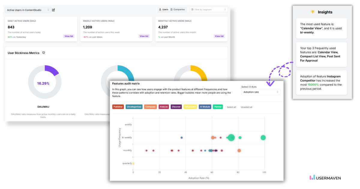
Analyze feature adoption to enhance user experience
Knowing how users interact with your features is essential for improving product experience. With Usermaven, you can easily track which features are being used the most and how frequently.
By monitoring feature adoption, you can identify which tools deliver the most value to your users and which might need refinement. For example, you can see which features are used regularly and which are being ignored. This insight helps you prioritize product improvements, refine existing features, and ultimately create a better user experience.
With Usermaven’s feature usage analysis, you’re always equipped with actionable quantitative data to inform product decisions, allowing you to iterate and refine based on user engagement, not assumptions.
Wrapping it up
Quantitative data analysis is all about gaining clarity. It turns numbers into insights and helps you make decisions that move your business forward.
With Usermaven as marketing attribution software, teams can connect quantitative data across channels, touchpoints, conversions, and revenue outcomes. That makes it easier to turn raw numbers into clear decisions and measurable growth.
Want to see how it all comes together? Book a demo to see how Usermaven can help you turn data into action.
FAQs about quantitative data analysis
1. How is quantitative data analysis different from qualitative data analysis?
Quantitative data analysis focuses on numerical data, providing measurable, objective insights into trends, averages, and patterns. In contrast, qualitative data analysis focuses on non-numerical data, such as opinions and experiences, offering a deeper understanding of motivations and behaviors.
2. How can quantitative data analysis improve the effectiveness of marketing campaigns?
Quantitative data analysis enables marketers to measure campaign performance by tracking metrics such as conversion rates, customer acquisition costs, and ROI. This allows marketers to adjust strategies in real-time, optimize targeting, and identify which campaigns are driving the best results.
3. Who typically uses quantitative data analysis?
Quantitative data analysis is used by a wide range of professionals, including data scientists, marketers, product managers, business analysts, and researchers. It’s especially valuable for decision-makers in SaaS, e-commerce, finance, and marketing to make data-driven decisions.
4. How do I collect quantitative data for analysis?
To collect quantitative data for analysis, use tools like website analytics, CRM systems, or user behavior-tracking tools to gather metrics on sales figures, user actions, and engagement.
5. What role do data visualization tools play in analyzing quantitative data?
Data visualization tools simplify complex data by presenting it in charts, graphs, and dashboards. It helps quickly identify patterns, trends, and outliers, making it easier for decision-makers to interpret and act on the data.
Ruler Analytics pricing is based on monthly website traffic and the level of measurement a business needs. Current plans start at $400 per month for up to 10,000 visits and rise to $2,000 per month for more than 100,000 visits. The final cost can also depend on product, data, and integration requirements. Features such as […]
A shopper may discover a product through a Meta ad, return through Google Search, open an email, and complete the order by visiting the store directly. Every platform may claim credit for the same sale. Without reliable ecommerce attribution, teams cannot tell which interaction created demand, which one assisted the decision, and which one simply […]
An agency onboards a new ecommerce client and realizes the attribution tool built for their B2B SaaS clients does not handle Shopify data at all. Two months later, a different client asks for white-labeled reports, and the same platform cannot produce them either. Most attribution tools help marketers see performance. Agencies need tools that help […]