Data visualization tools transform raw numbers and complex datasets into visual formats like charts, graphs, maps, and interactive dashboards. These powerful software applications help users identify relationships, trends, and patterns that might remain hidden in spreadsheets or text-based reports. The visualization process relies on three fundamental components: the underlying data (the raw information), the narrative (the story the data tells), and the visual elements (the graphical representation that communicates insights).
Have you ever tried making sense of thousands of rows in a spreadsheet?
The right visualization tool turns that overwhelming experience into an intuitive one, allowing you to extract actionable insights without diving into the raw numbers.
Let’s dig into the details.
What is data visualization, and why is it important for marketers?
Data visualization transforms raw numbers and statistics into visual formats that reveal patterns at a glance. It’s the process of converting complex datasets into charts, graphs, maps, and interactive dashboards that make information immediately understandable. Rather than struggling through spreadsheets filled with numbers, visualization helps marketers spot trends, identify outliers, and understand relationships between different metrics.
What happens when you can actually see your marketing data instead of just reading it?
Marketing teams today are drowning in data. From website analytics and social media metrics to email performance and conversion rates, the sheer volume of information can be overwhelming. Data visualization tools transform this flood of numbers into clear insights that drive strategy.
When presenting to stakeholders or clients, visualizations communicate performance much more effectively than spreadsheets or text reports. They tell compelling data stories that justify marketing investments and demonstrate impact.
In an era where marketing budgets face increasing scrutiny, the ability to clearly show what’s working (and what isn’t) through visualization has become essential. Teams that master data visualization gain a significant competitive advantage by making faster, more informed decisions backed by clear visual evidence.
Top data visualization tools for marketers in 2026
Data visualization tools have become essential for marketers to make sense of growing data streams, uncover insights, and communicate performance clearly. Whether you’re analyzing campaign effectiveness or presenting trends to stakeholders, the right tool can simplify complexity and speed up decision-making. Below is a comparison of the top data visualization tools for marketers in 2026.
Teams with large datasets and complex visualization needs
Extensive library of visualizations, handles large datasets, mapping capabilities
Tiered licensing (Desktop, Public, Server)
Microsoft Power BI
Organizations using Microsoft ecosystem
Natural language queries, real-time dashboards, Excel integration
Free basic version, Premium subscription
Zoho Analytics
Cost-conscious teams needing versatile visualization
500+ data connectors, drag-and-drop interface, AI assistants
Tiered subscription
Looker Studio
Google-centric marketing teams
Free, seamless Google integration, shareable interactive reports
Free
Coupler.io
Marketers needing automated data integration
No-code data syncing, scheduled imports, data transformations, dashboard templates, AI insights
Freemium with paid plans
Usermaven
Usermaven stands out as a marketing analytics platform designed specifically for ease of use while delivering powerful insights. Unlike complex analytics tools that require extensive setup, Usermaven offers automatic event tracking that captures visitor behavior without requiring custom code implementation.
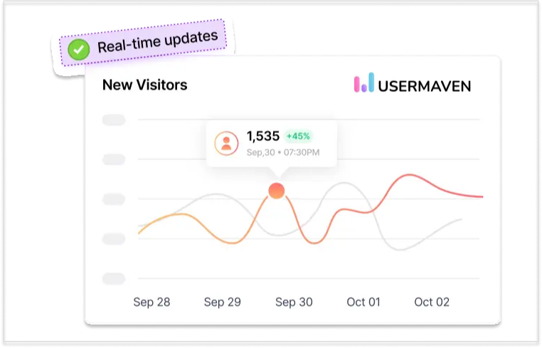
Real-time analytics in Usermaven
The platform is a powerful data visualization tool that provides real-time visualization dashboards that make marketing data immediately understandable and actionable. Its intuitive interface allows marketers to create customized reports that focus on the metrics that matter most to their specific goals.
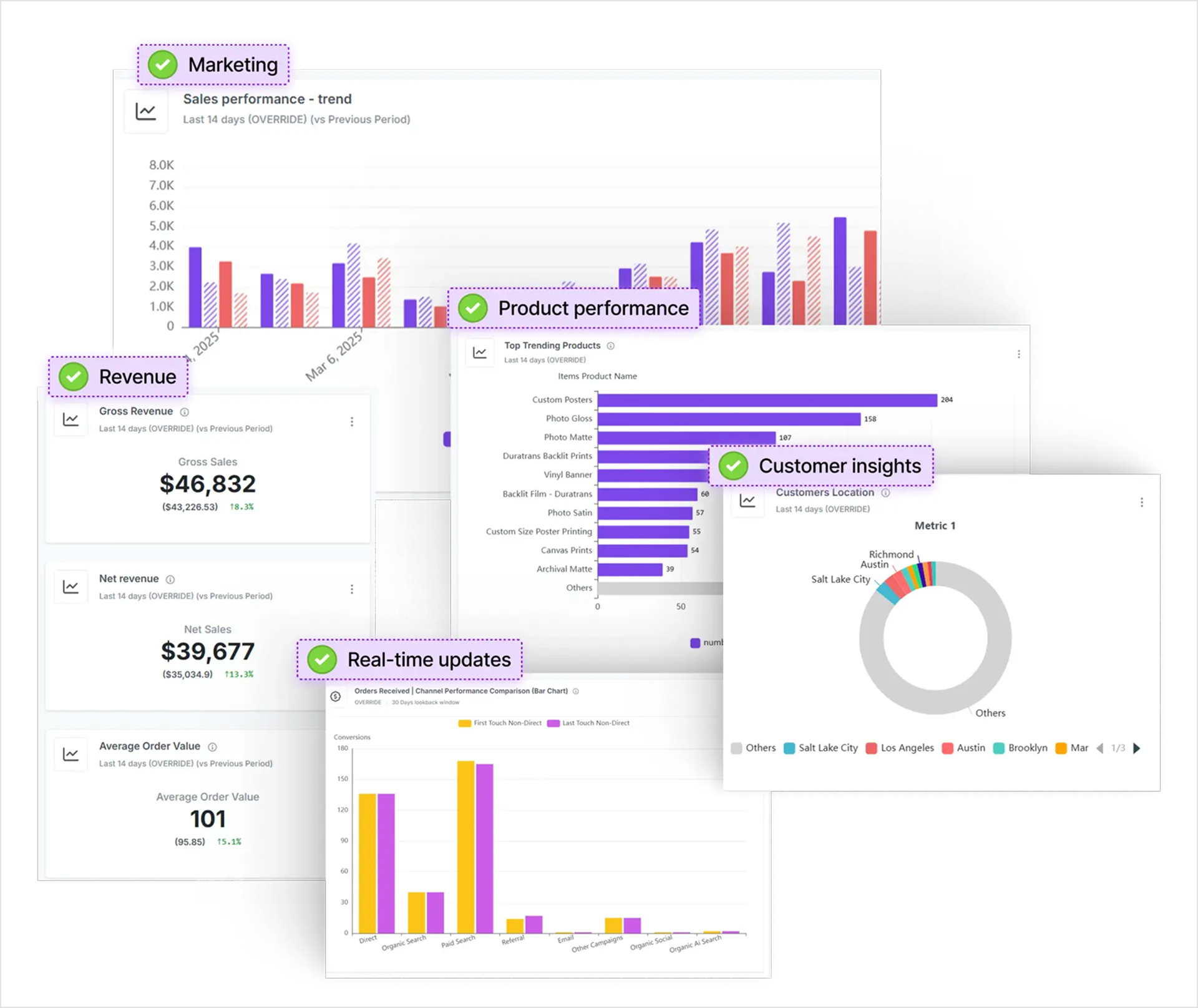
Usermaven offers both pre-built and custom dashboards to support a wide range of analytical needs and to serve as a data visualization tool. The pre-built dashboards cover key areas such as acquisition, engagement, funnels, retention, revenue, and attribution, giving marketers instant access to the most relevant KPIs without additional configuration. For more tailored analysis, custom dashboards allow users to design their own layouts by selecting specific charts, filters, and metrics that align with individual goals or campaign needs.
Analytics dashboards in Usermaven
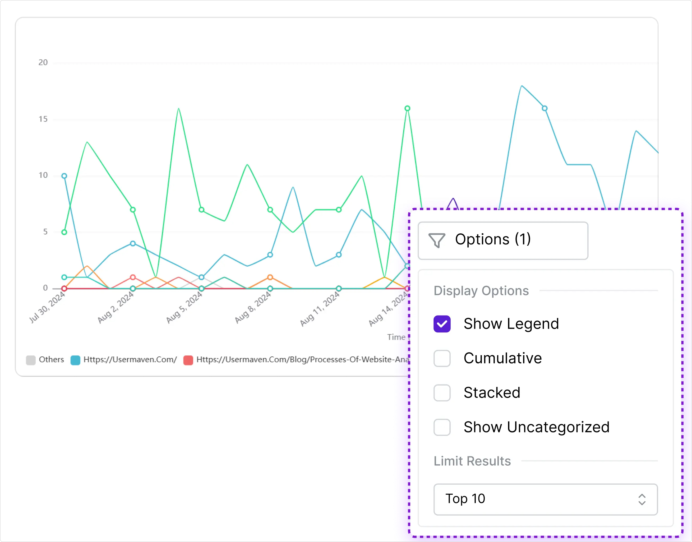
The Trends feature gives marketers a high-level view of how performance metrics evolve over time. Whether it’s monitoring daily active users, traffic spikes, or conversion fluctuations, Trends helps surface key patterns and shifts that guide data-driven decisions. With AI-powered analysis, Usermaven highlights important changes automatically, so users don’t miss emerging opportunities or hidden issues.
Trends in Usermaven
Usermaven excels at unifying website and product analytics in one platform, giving marketers a comprehensive view of the entire customer journey. This eliminates the need to switch between multiple tools to understand how marketing initiatives impact product usage.
One of Usermaven’s most valuable features is its privacy-friendly design, which maintains compliance with GDPR and CCPA while still collecting essential marketing data. Its white-labeling technology circumvents ad blockers, ensuring more accurate data collection than many competing tools.
The platform’s AI-powered insights automatically identify patterns and anomalies in marketing data, bringing important trends to marketers’ attention without requiring manual analysis. Shareable dashboards make it easy to distribute these insights across teams and to stakeholders, improving collaborative decision-making.
AI-powered features in Usermaven
For marketers looking for a streamlined, user-friendly alternative to complex analytics platforms, Usermaven delivers the essential visualization capabilities needed for data-driven marketing without the technical overhead.
Tableau
Tableau remains one of the most powerful data visualization tools available to marketers, known for its robust capabilities and flexibility. The platform comes in several versions – Tableau Desktop for individual analysis, Tableau Public for sharing visualizations online, and Tableau Server for enterprise-wide deployment.
What makes Tableau particularly valuable for marketing teams is its extensive library of visualization options combined with an interface that balances power with accessibility. Marketers can create sophisticated interactive dashboards that allow stakeholders to explore data from multiple angles.
The platform excels at handling large datasets, making it ideal for marketing teams dealing with extensive customer data, multi-channel campaign metrics, or years of historical performance data. Its data connectors integrate with virtually any marketing data source, from CRM systems to social media platforms.
Tableau’s mapping capabilities are especially useful for location-based marketing analysis, allowing visualization of regional performance, store locations, or customer distribution with impressive detail and interactivity. While Tableau has a steeper learning curve than some alternatives, its extensive training resources and supportive user community help marketers master its capabilities.
Microsoft Power BI
Microsoft Power BI has established itself as a leading data visualization tool, particularly for marketing teams already working within the Microsoft ecosystem. Its seamless integration with Excel, Dynamics 365, and other Microsoft products creates a familiar environment that reduces the learning curve.
Power BI excels at handling large, complex datasets from multiple sources, making it well-suited for comprehensive marketing analytics. Its real-time dashboards update automatically as new data comes in, giving marketers immediate visibility into campaign performance.
The platform’s natural language query feature allows marketers to ask questions about their data in plain English and receive visualizations in response. This accessibility empowers non-technical team members to explore data independently without needing to understand query languages.
With mobile apps and embedded analytics options, Power BI ensures marketing insights are available anywhere, whether in client meetings, executive presentations, or on the go. While some advanced features require technical knowledge, the platform’s core visualization capabilities remain accessible to marketers of varying skill levels.
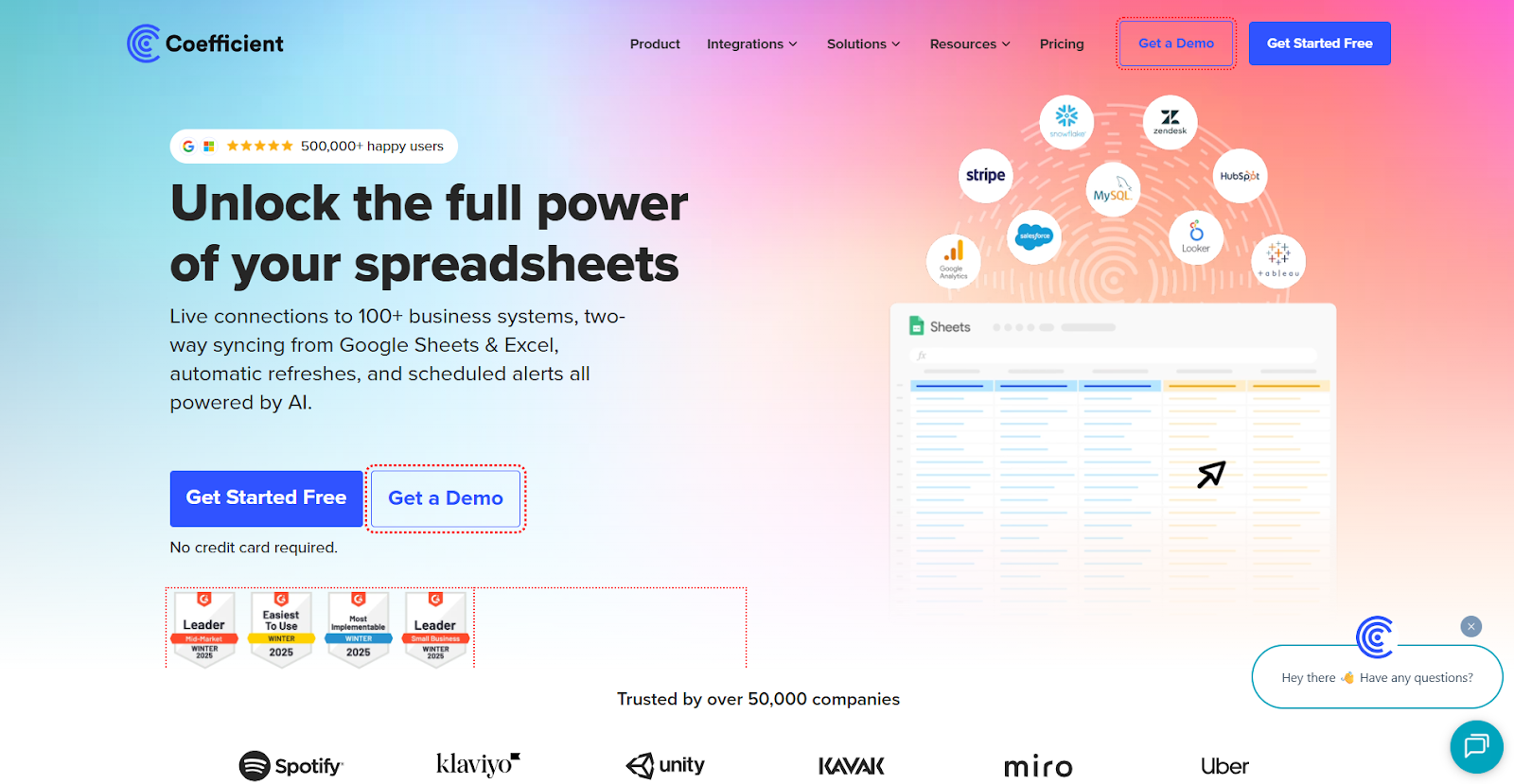
Coefficient
Coefficient connects Google Sheets and Excel directly to over 100 data sources, including CRMs, databases, and marketing platforms. With no-code connectors, users can quickly import and filter data, creating visualizations directly in the spreadsheets they already know.
The tool supports building live pivot tables, charts, and dashboards that update automatically on a schedule. This ensures that marketing reports and analytics always reflect the latest data without the need for manual exports or copy-pasting. Their AI Assistant also helps you clean up data, create formulas, and charts in Google Sheets, reducing repetitive tasks within spreadsheets.
Beyond importing data, Coefficient also offers two-way sync, allowing updated or cleaned rows to be pushed back into CRMs or databases. This helps maintain a single source of truth and streamlines workflows across teams.
Additional features include pre-built report templates and automatic alerts via Slack or email when key metrics change. For teams that prefer tracking KPIs and building visualizations inside spreadsheets rather than in a separate BI tool, Coefficient provides a convenient and flexible solution.
Zoho Analytics
Zoho Analytics offers a cost-effective solution for marketing teams seeking powerful visualization capabilities without enterprise-level pricing. Its cloud-based platform features an intuitive drag-and-drop interface that makes creating reports straightforward, even for data visualization beginners.
With over 500 data connectors, Zoho Analytics integrates well with most marketing platforms and data sources. This extensive connectivity allows marketers to bring together data from websites, email campaigns, social media, and sales in unified dashboards.
The platform emphasizes quick time-to-insight, with features that help marketers build custom visualizations rapidly. Auto-blending capabilities combine data from different sources without complex formulas or joining operations, simplifying the analysis of cross-channel performance.
Zoho Analytics also includes AI-powered assistants that help suggest appropriate visualizations for different data types and can even generate insights automatically. These features make it particularly suitable for small to medium-sized marketing teams without dedicated data analysts.
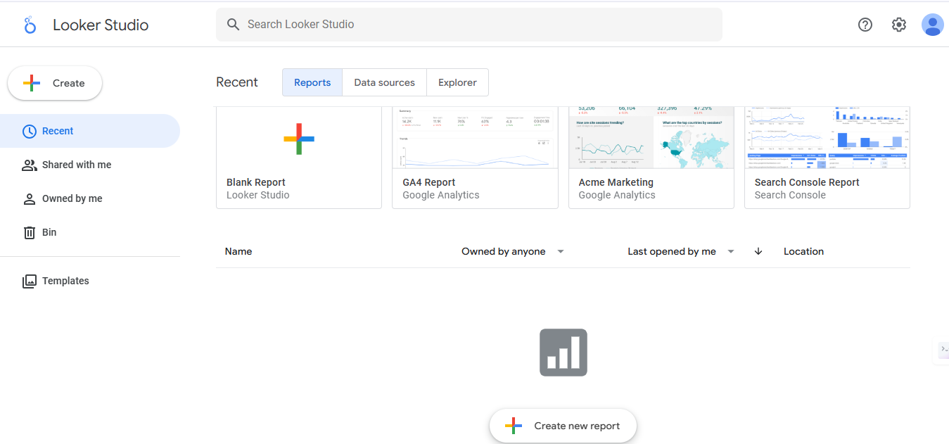
Looker Studio (formerly Data Studio)
Looker Studio offers a free, web-based visualization solution that integrates seamlessly with Google’s marketing tools and platforms. For teams already using Google Analytics, Google Ads, or other Google services, Looker Studio provides a natural extension for visualizing marketing performance.
The platform’s straightforward interface allows marketers to create customizable reports and dashboards without technical expertise. Templates for common marketing reports accelerate the process, while customization options ensure visualizations align with brand standards.
Looker Studio excels at creating shareable, interactive reports that update automatically as new data comes in. This makes it particularly valuable for ongoing campaign monitoring and regular performance reporting to stakeholders or clients.
While its functionality may be less extensive than some paid alternatives, Looker Studio’s price point (free) and native integration with the Google ecosystem make it an excellent starting point for marketing teams beginning their data visualization journey.
Coupler.io
Coupler.io is a data integration and AI analytics platform that helps marketing teams collect, transform, and visualize data from multiple sources in a single place. It connects popular marketing tools such as Google Ads, Facebook Ads, HubSpot, and many others directly to spreadsheets, data warehouses, and BI tools.
The platform is especially useful for building automated dashboards that keep marketing data continuously up to date. Users can set up recurring data imports that refresh at defined intervals, ensuring that visualizations always reflect the latest campaign performance.
Built-in transformation features allow teams to clean, merge, and structure data before its visualization. To speed up the setup, Coupler.io provides pre-built dashboard templates for common use cases like PPC reporting, social media performance, and cross-channel marketing analytics.
Coupler.io also offers an AI agent and integrations with AI tools that help streamline analytics workflows across marketing data. The AI agent can assist with exploring datasets, summarizing performance trends, and highlighting notable changes in campaign metrics without requiring manual analysis.
Other noteworthy tools
Beyond the major players, several specialized visualization tools offer unique capabilities for marketing teams with specific needs.
Infogram provides a user-friendly platform focused on creating engaging infographics and visual reports. Its drag-and-drop interface and extensive template library make it accessible to marketers without design backgrounds, while its interactive features add engagement to published content. The platform is particularly effective for creating visually appealing content marketing assets that incorporate data storytelling.
Datawrapper has gained popularity among marketing teams that regularly publish data-driven content. Designed originally for newsrooms, it creates clean, professional charts and maps optimized for online publication. Its simple interface masks powerful capabilities, allowing marketers to produce publication-quality visualizations quickly.
Flourish specializes in interactive storytelling with data, offering templates for creating animated and interactive visualizations that guide viewers through complex information. These narrative-focused visualizations work exceptionally well for marketing presentations, case studies, and data-driven content marketing.
Domo differentiates itself with its business cloud approach, connecting data from across the organization into marketing-friendly visualizations. Its mobile-first design ensures executives and field teams can access marketing insights anywhere, while its alert system proactively notifies marketers of significant changes in performance metrics.
Qlik Sense uses an associative data model that helps marketers discover unexpected connections in their data. This approach can reveal hidden relationships between marketing variables that might be missed in traditional analysis. For sophisticated marketing teams seeking deeper insights, Qlik’s unique exploration capabilities offer significant value.
How to choose the right data visualization tool for your marketing needs
Choosing the right data visualization tool requires more than just comparing features – it’s about aligning the tool with your marketing goals, team capabilities, and data ecosystem. By asking the right questions across key factors, you can ensure the solution you select not only meets your current needs but also scales with your growth. Here’s a breakdown of what to consider:
Consideration factor
Questions to ask
Why it matters
Goals & audience
Who will create and consume the visualizations?
Ensures tool complexity matches user skills
Features & capabilities
Does it support your needed chart types?
Prevents workflow limitations after adoption
Data sources
Can it connect to all your marketing platforms?
Eliminates manual data importing
Performance
How does it handle your data volume?
Prevents frustrating slowdowns
Cost & scalability
What’s the total cost of ownership?
Avoids unexpected expenses and limitations
Support & community
What resources are available for learning?
Accelerates team adoption and proficiency
Follow these steps when selecting a data visualization tool:
Define your specific marketing goals and identify your audience
Evaluate features against your specific visualization needs
Consider cost factors and scalability requirements
Explore available support resources and community
Test the tool with your actual marketing data before committing
Define your goals and audience
Before evaluating specific tools, clarify exactly what marketing questions you need your visualizations to answer. Are you focused on campaign performance analysis, customer journey mapping, budget optimization, or competitive benchmarking? If performance marketing attribution is part of that goal, your tool should make it easier to see how paid channels contribute across the full journey. Different tools excel at different types of marketing analysis, especially when zero party data marketing is part of your broader strategy.
Consider who will be using the visualization tool. Is your team comprised of data-savvy analysts, or will non-technical marketers need to create their own reports? Some platforms cater to technical users with powerful customization options, while others prioritize accessibility for broader teams.
Think about your audience for the finished visualizations. Executive stakeholders might need high-level dashboards with clear KPIs, while campaign managers require detailed, interactive reports for optimization. Client-facing reports often benefit from customizable branding and presentation-ready formatting.
Understanding these fundamental requirements will narrow your options and ensure you focus on tools that align with your specific marketing use cases rather than getting distracted by features you’ll rarely use.
Evaluate features and capabilities
Assess whether potential tools support the specific visualization types your marketing team needs most. Campaign analysis might require funnel visualizations, while market research could depend on sophisticated mapping capabilities. Make a prioritized list of must-have chart types and interactive features.
Does your marketing team work with diverse data sources? Evaluate how each tool handles data integration from your critical platforms – website analytics, CRM, social media, email marketing, and advertising networks. Native connectors save considerable time compared to manual data imports.
Test the tool’s performance with realistic data volumes. Some visualization platforms slow down significantly with large datasets or complex calculations, which becomes frustrating during day-to-day use. If you’re working with millions of customer records or years of historical data, this performance factor becomes critical.
Also, consider the balance between guided analysis (pre-built reports) and self-service exploration. Marketing teams often need both standardized reporting for regular monitoring and flexible exploration for investigating new questions as they arise.
Consider cost and scalability
Data visualization tool pricing models vary widely, from free options with limited features to enterprise platforms with per-user licensing that can cost thousands annually. Evaluate pricing against your available budget, considering both immediate needs and potential growth.
Are there hidden costs beyond the base subscription? Some tools charge additional fees for features like advanced analytics, extra storage, premium data connectors, or API access. These can significantly impact the total cost of ownership over time.
Consider how the tool will scale with your marketing operation. Will it accommodate more users, larger datasets, or additional data sources as your team grows? Changing visualization platforms later can be disruptive and expensive, so choosing a tool with headroom for expansion is valuable.
For marketing agencies or consultancies, also evaluate whether client-specific customization is available. White-labeling capabilities and multi-client management features might justify a higher investment if they align with your business model.
Explore support and community
The availability of learning resources significantly impacts successful adoption. Investigate what training materials, documentation, and tutorials exist for each tool you’re considering. Video tutorials, knowledge bases, and guided learning paths can accelerate your team’s proficiency.
Active user communities provide valuable peer support when challenges arise. Look for tools with vibrant forums, user groups, or resource-sharing platforms where marketers can exchange templates, techniques, and solutions to common problems.
Consider the vendor’s support options and responsiveness. Is technical support included in the base price, or is it an additional cost? Are support hours aligned with your working schedule? For mission-critical marketing reports, reliable support becomes especially important.
Some data visualization tools also offer certification programs that can enhance your marketing team’s skills and credentials. These structured learning paths can transform your team from basic users to visualization experts capable of extracting maximum value from the platform.
Power up your SaaS with perfect product analytics
*No credit card required
Conclusion
The right data visualization tools transform complex information into clear, actionable insights that drive better business decisions. Effective visualization is both science and art, combining technical accuracy with thoughtful design to reveal the stories within your data. As visualization technology continues to evolve with AI enhancements and more intuitive interfaces, the accessibility gap between data experts and business users continues to narrow.
By selecting tools that match your specific requirements and following best practices for visualization design, you can transform data from an underutilized asset into a competitive advantage that informs strategy and improves outcomes across your organization.
FAQs
1. What is data visualization in marketing?
Data visualization in marketing is the process of turning raw data into visual formats like charts, graphs, and dashboards to uncover trends, patterns, and insights that support better marketing decisions.
2. Why do marketers need data visualization tools?
Marketers need data visualization tools to simplify complex data, improve reporting, track campaign performance, and communicate results clearly to stakeholders or clients.
3. What are the most important features to look for in a data visualization tool?
Key features include real-time dashboards, interactive charts, AI insights, integrations with data sources, customization options, and ease of use.
4. How do data visualization tools improve marketing performance?
They help identify high-performing channels, optimize campaigns, detect trends early, and make faster, data-driven decisions with clear visuals instead of raw spreadsheets.
5. What is the role of data visualization in modern marketing?
Data visualization helps marketers quickly understand performance data, spot trends, and present insights clearly to teams and stakeholders for faster decision-making.
6. How can data visualization tools help optimize marketing campaigns?
These tools turn raw data into actionable visuals, allowing marketers to identify what’s working, fix what’s not, and allocate resources more effectively.
7. What types of marketing data can be visualized?
You can visualize website traffic, campaign performance, user behavior, ROI metrics, social media engagement, email analytics, and customer journey data.
8. What should marketers look for in a data visualization tool?
Look for tools with real-time reporting, integrations (like Google Ads or CRM platforms), ease of use, customizable dashboards, and AI-powered insights.
9. Are data visualization tools useful for non-technical marketers?
Yes, most modern tools offer intuitive interfaces, drag-and-drop functionality, and pre-built templates, making them accessible even to non-technical users.
10. Can small marketing teams benefit from data visualization tools?
Absolutely. Even small teams can use these tools to gain clarity on performance, reduce manual reporting, and make smarter marketing decisions faster.
A SaaS marketing team evaluates six attribution tools over three months and signs a $ 24,000-a-year contract. Eight weeks into implementation, they realize the tool tracks pipeline beautifully but has no idea what happens to a customer after the deal closes. Choosing the wrong attribution tool is expensive twice, once in the contract, once in […]
Every company wants better data. But better data does not come from adding another dashboard, tracking every possible event, or giving the data team a long list of reports to build. That is where many analytics implementation projects start to go wrong. The tool may be powerful. The data may be there. The team may […]
A product signal loses value every minute it sits unexplained. When a funnel starts leaking, a feature underperforms, or churn rate starts to rise, the challenge is not just noticing that something changed. It is figuring out what changed and what to do next while the signal still matters. That is where AI-powered product analytics […]