Plenty of “good” releases go unused because users don’t notice, understand, or need them yet. And unused features rarely do anything for retention.
Feature usage helps you see that gap. It tells you what’s getting pulled into real workflows, where adoption stalls, and what’s quietly creating value that keeps users coming back.
In this guide, we’ll explore feature usage analysis in depth, revealing what users do, why it matters, and how to act on it.
What is feature usage?
Feature usage shows how people use a specific part of your product over time. It tells you how often it’s used, who’s using it, and what’s happening around that usage, so you can see whether it’s delivering real value.
Instead of stopping at “did they log in?”, you look at which feature they engaged with, how frequently they returned, and what happened before and after. In simple terms, this is a focused product feature analysis within your broader product analytics view.
When you track feature usage effectively, you can:
Compare features against each other
Build reliable product feature statistics
Make confident decisions about what to improve, keep, or cut
It becomes the foundation for meaningful usage analysis, not just for vanity metrics.
Why is tracking feature usage important?
There are plenty of reasons to track feature usage. The biggest one is that it turns product decisions into something you can prove.
See what users actually value: Feature usage highlights the actions that customers return to, and the moments that feel like real progress. It often points straight to your aha moments.
Improve the product experience: Usage patterns show where users hesitate, drop off, or take workarounds. That’s how you smooth the path and make features easier to adopt.
Identify power users and what they do differently: Power users tend to follow repeatable workflows. When you know which features they rely on, you can guide more users toward the same outcomes.
Make data-backed product calls: With feature usage, you’re not guessing what to build next. You have behavior to support what to improve, what to promote, and what to rethink.
At the end of the day, tracking feature usage is how you learn from real behavior and build a product experience that gets users to value faster.
Key feature usage metrics
You do not need dozens of charts to understand feature usage. Instead, you need a tight set of feature usage metrics that tell you what actually matters.
Feature adoption: The share of active users who used the feature in a set period. It’s the fastest way to see whether adoption is real and how it contributes to overall product engagement.
User activation: The number of new users who complete the key actions that show they’re experiencing value and moving forward with the product.
Time to value: How long it takes users to reach real value from the feature after signing up or first seeing it. If it’s slow, you likely have friction, or the value isn’t clear.
Feature usage frequency: How often users come back to the feature each week or month. It shows whether the feature is becoming routine.
Usage depth: How far users progress beyond the first action inside the feature. It helps you see if they reach value or stop halfway
Drop-off within the feature flow: The step where users quit after starting. It’s a clear signal of friction in the UX or onboarding.
Types of feature usage data
You can look at feature usage through a few simple lenses. Each one answers a different question and fits a different stage of the product adoption curve.
Binary view: Indicates whether a user touched the feature within a given period. This works well for discovery-focused features.
Frequency view: Counts how many times users rely on a feature per day, week, or month. This allows you to perform a product trend analysis to see if a feature is becoming a daily habit or fading into the background.
Depth view: Follows how far a user goes inside a feature flow. This view works best for complex features that require several actions.
Calculating feature usage rate
Feature usage rate shows how widely a feature is being adopted inside your product. It tells you whether a feature is reaching enough users to matter, or staying limited to a small slice of the base.
It’s calculated by comparing the number of unique users who used the feature to the total number of unique users in the product during the same time window.
How to interpret it: A higher rate usually means the feature is discoverable, relevant, and easy to adopt. A low rate can mean users don’t see it, don’t understand it, or don’t need it yet. The key is to pair this with context, such as time-to-value and usage frequency, before making decisions.
Example: If 1,000 unique users use the feature and you have 5,000 total unique product users in that period:
(1,000 ÷ 5,000) × 100 = 20%
Strategies to increase feature usage rate
A higher feature usage rate usually comes from removing confusion, not adding more prompts.
Make the value obvious at first glance: Name the outcome in plain language and show what “success” looks like. If users can’t tell why it matters, they won’t try it.
Shorten time-to-value: Get users to the first meaningful result with fewer steps, better defaults, and guided setup. Speed here drives both adoption and repeat use.
Target onboarding using segments: New users, returning users, and different roles need different paths. Use segments so the guidance matches intent, not a generic checklist.
Fix the step where users drop: Track the feature flow and identify the exact point at which users abandon it. Then simplify that moment, remove blockers, or clarify what to do next.
Turn first use into retained usage: Add simple triggers that pull users back when the feature is most useful, like after a milestone, weekly cadence, or related action. That’s how feature usage frequency becomes routine.
5 steps to conduct feature usage analysis
Feature usage analysis works best when you keep it simple. Define the signal, trust the data, and connect it to outcomes you actually care about.
1) Define what “usage” really means
Pick one action that proves the feature delivered value.
Skip clicks and pageviews. Focus on the first moment that shows true intent.
Choose a clear trigger event (e.g., created, sent, invited, exported)
Set a time window (daily, weekly, monthly)
Decide what counts as meaningful use (once vs. repeated use)
2) Track the right events and validate them
If tracking is messy, your analysis won’t hold up. Make sure events fire consistently and reflect real behavior.
Capture user + account IDs
Include key properties (plan, role, device, etc.)
Spot-check samples to confirm events aren’t missing or duplicated
3) Break usage down by segments
Overall usage hides the truth. Segments show you who the feature is actually for.
New vs. existing users
Plan tiers
Roles or personas
Power users vs. casual users
4) Connect usage to outcomes
Usage is only useful if it maps to retention, activation, or expansion. This is where it becomes actionable.
Compare retention for users who adopted the feature vs. those who didn’t
Track time to first use and how it affects conversion Check whether heavier usage correlates with upgrades or seat growth
This is the ideal time for post-launch analysis to verify if a new feature release actually shifted your key business goals.
5) Turn insights into a decision
Every analysis should end with a clear next move. Otherwise, it’s just reporting.
If it drives outcomes, improve discoverability, and reduce friction
If it’s valuable but underused, fix onboarding and education
If it doesn’t move anything, reposition it or cut the maintenance cost
Essential tools for tracking feature usage
To track feature usage properly, you need a product analytics platform built for behavior, not page views. Here are the essentials to look for:
Event tracking: Capture every meaningful feature action as an event, with properties for context. This is what makes your data reliable.
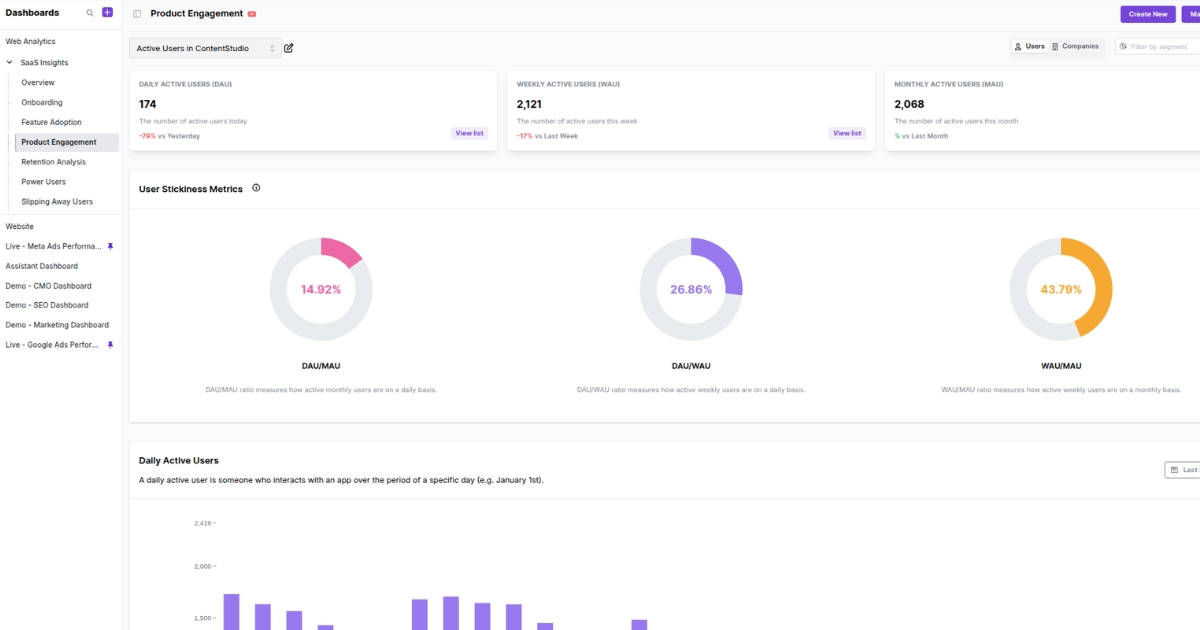
Feature usage dashboard: A clear dashboard that shows what’s being used, how it’s trending, and which features are gaining or losing traction.
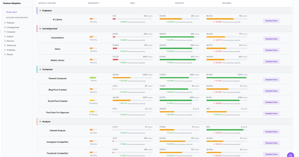
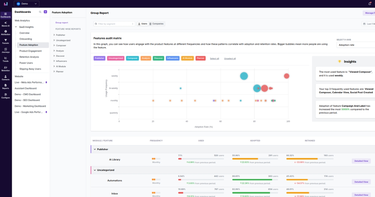
Feature usage and adoption report: A report that covers feature adoption metrics like adoption, retained usage, and usage frequency in one place.
Segments: Built-in segments so you can break usage down by plan, persona, lifecycle stage, or account type. This is how you explain changes in product engagement metrics.
Cohort analysis: Cohorts that track feature usage over time to see whether adoption sticks. It’s the quickest way to connect feature usage to retention.
Power up your SaaS with perfect product analytics
*No credit card required
Real-world examples of feature usage analysis
Here are simple, real-world examples of what to track, what “good usage” looks like, and what you’d do with the insight.
Music app: Offline downloads
A click on “Download” isn’t the win. The win is listening when there’s no connection, because that’s when the feature proves its value.
What you track:
Download started vs. download completed
Offline play sessions (and how soon they happen after a download)
Repeat offline plays over the next 7–30 days
What does it tell you: If people download but don’t play offline, the feature isn’t landing. Maybe they don’t understand when it helps, or the setup feels slow.
What you do next: Improve the moment of need. Prompt downloads when signal drops, add a “download your commute” flow, or reduce steps to save a playlist offline.
Project management tool: Assigning tasks with due dates
Anyone can open a task list. Usage shows up when tasks get assigned, deadlines get set, and the work actually moves forward. That’s when the tool becomes part of how a team operates.
What you track:
Tasks created with an assignee + due date
Repeat usage per account (weekly frequency)
Adoption by role (PM vs. contributor)
What does it tell you: If accounts create tasks but skip due dates, they’re using the tool like a notes app. That usually means the value isn’t clear, or the workflow feels optional.
What you do next: Make “due date” part of the default flow. Add templates, nudge users to set deadlines during creation, and show a “due soon” view that rewards the behavior.
Fitness app: Workout plan completion
Starting a workout is the easy part. The real value shows up when someone keeps coming back and follows the plan. That’s what turns a one-off try into a lasting habit.
What you track:
Plan created vs. first workout completed
Completion rate across week 1 and week 4
Drop-off point (which day/workout people abandon)
What does it tell you: If lots of users start but don’t complete workouts, your onboarding may be too ambitious. Or the plan is too hard, too soon.
What you do next: Shorten time-to-first-win. Offer a 10-minute starter plan, celebrate early streaks, and adapt difficulty based on missed sessions.
Common feature usage pitfalls (and how to fix them)
Feature usage data is only useful when it’s clean, focused, and tied to action. Here are four common mistakes teams run into, and how to correct them:
Low adoption rate: Users may not notice the feature or understand why it matters. Fix this by improving discovery within the core workflow and making the first-value moment easier to reach.
Data collection accuracy issues: When events are inconsistent or missing context, your reports stop being trustworthy. Fix this by standardizing event names, adding required properties, and regularly auditing what’s firing in production.
Technical integration hurdles: Tracking can get delayed or break when the product changes, and no one owns the instrumentation. Fix this by starting with a small tracking plan, using stable SDK patterns, and documenting event definitions to make them easy to maintain.
Too many metrics: If you track everything, it becomes hard to tell what matters and what to act on. Fix this by focusing on a small set of feature adoption metrics tied to adoption, frequency, and retained usage.
Leveraging Usermaven for feature usage analysis
Usermaven is an AI-powered analytics and attribution platform that bridges the gap by unifying website and product data in a single interface. This unified view allows teams to track the entire lifecycle of a user, from their first site visit to their consistent engagement with specific product features.
By eliminating the technical barrier between marketing and product data, Usermaven fits as a marketing attribution platform for teams that need to identify which acquisition channels drive high-value feature adoption. It provides a clear, data-driven roadmap for product teams to understand exactly how their functionality is being used in real time.
Here’s how Usermaven empowers your feature usage analysis:
No-code event tracking: Automatically captures clicks and feature interactions from day one, and lets you add custom events without developer-heavy tagging or manual instrumentation.
Built-in feature usage dashboard: Offers a dedicated workspace to categorize features into modules and track users through “Used,” “Adopted,” and “Retained” stages.
Segmentation: Groups users by specific feature interactions, allowing you to compare the behavior of “power users” with that of users at risk of churn.
Cohort analysis: Measures the product stickiness of specific features by tracking how frequently different user groups return to them over weekly or monthly periods.
User journeys: Traces the step-by-step actions users take before and after using a feature to uncover the most common paths to success.
Funnels: Visualizes the specific path users take toward a feature, identifying exactly where they drop off or encounter friction.
AI-generated insights: Surface hidden trends and anomalies in usage patterns that manual monitoring often misses.
Wrapping up
Total traffic numbers tell you if people are showing up, but feature usage tells you if they have a reason to stay. To build a product that lasts, you have to move past “active user” counts and start measuring the depth of engagement within your specific tools.
This is where Usermaven stands out. As a comprehensive website analytics tool, it bridges the gap between marketing attribution and in-app behavior. Instead of struggling with manual event tracking, you get a “no-code” way to see exactly which features are driving upgrades and where users are losing momentum.
If you want a clearer view of what drives feature usage and what stalls it, start a free trial or book a demo for a quick walkthrough.
FAQs about feature usage
1. What is a feature usage index?
A feature usage index is a single score that combines adoption, frequency, depth, and retention to summarize feature health. It helps you compare features and prioritize what to improve or promote.
2. What metrics show whether a feature is being adopted?
Use adoption rate, time to first value, repeat usage, depth of use, and adopter retention. Together, they show discovery, value, and whether the feature becomes part of a workflow.
3. How do you measure feature usage?
Track the one action that proves value, then measure adoption rate, usage frequency, depth, and drop-off over a set period. Validate impact by comparing retention or conversion for adopters vs. non-adopters.
4. How do you analyze feature usage in a social networking app?
Measure the core actions that create connection and habit (follow, post, comment, message, invite) and how fast users reach them. Segment by cohort and user type to see what behaviors predict retention.
5. What tools help analyze user engagement in apps?
Use analytics tools that support event tracking, funnels, cohorts, journeys, and segmentation to tie behaviors to outcomes. Common options include Usermaven, Mixpanel, and Amplitude.
A SaaS marketing team evaluates six attribution tools over three months and signs a $ 24,000-a-year contract. Eight weeks into implementation, they realize the tool tracks pipeline beautifully but has no idea what happens to a customer after the deal closes. Choosing the wrong attribution tool is expensive twice, once in the contract, once in […]
Your traffic is up. But revenue isn’t. What’s going on? When marketers open their web analytics dashboard, sessions are usually the first number they check. It tells you how many times people visited your site, but a rising session count doesn’t always mean things are going well. In analytics, the number of sessions is the […]
Every company wants better data. But better data does not come from adding another dashboard, tracking every possible event, or giving the data team a long list of reports to build. That is where many analytics implementation projects start to go wrong. The tool may be powerful. The data may be there. The team may […]