You have 10 seconds. That’s all the time a visitor gives your website before deciding: “This is for me.” OR “Nope, not what I’m looking for.”
And that decision almost always comes down to one thing: Your website value proposition.
If your message is unclear, generic, or too complicated, people leave, even if your product is exactly what they need.
This is one of the most common problems across websites today. Not website visitors. Not design. Not even the product.
Let’s break down how to communicate your website’s value proposition clearly and effectively. We’ll use practical frameworks, simple examples, and real-world insights, and you can apply these ideas right away.
What is a website value proposition?
A website value proposition is how you communicate the value of your product or service on your website, especially on your homepage, where most visitors land first.
It’s the first thing people see, and it plays a big role in whether they stay or leave. Within a few seconds, your website should clearly answer three basic questions:
If your website doesn’t answer these questions quickly, visitors will likely move on.
Components of a website value proposition
A strong website value proposition is not just about writing a headline. It’s about clearly communicating three core things:
What your product is
who it’s for
Why is it better than other options
These three elements come from how value propositions actually work in practice: product, customer, and substitutes (alternatives).
Now let’s break down each component.
1. Product (what you offer)
This explains what your product does and what problem it solves. Your goal here is simple: make it instantly clear what your product is
To make this clearer, let’s use a real example.
ContentStudio is a social media management platform that helps marketers, agencies, and brands manage, schedule, and analyze content across multiple social channels from one place.
On ContentStudio’s homepage, the headline says: “The easiest way to manage and grow your social channels.” This works because it clearly communicates:
What the product does → manage and grow social media
The core value → it’s easy to use
There’s no confusion. You immediately understand the product.
2. Customer (who it’s for and why it matters)
This defines who your product is built for and what they care about. Users should instantly feel that this is for me.
ContentStudio does this in the supporting text: “for agencies, brands, and marketers.”
This clearly identifies the audience. It also adds a benefit: “stay organized and get more done in less time.” Now the message connects with the user’s goal:
Saving time
Being more efficient
So it’s not just about the product, it’s about the outcome for the customer.
3. Substitutes (why choose you over alternatives)
Users are always comparing your product to something else. That could be:
Other tools
Spreadsheets
Manual posting
Or their current workflow
Your value proposition should answer: “why should I switch?”
ContentStudio communicates this through positioning like: “the easiest way”,“simple yet powerful.” This suggests:
It’s easier than other tools
It reduces complexity
It can replace multiple tools
They reinforce this with:
Product UI previews (showing scheduling and calendar features)
All of these signals that this is a better, simpler alternative to what you’re using now.
Why most websites fail to communicate their value
Most websites sound something like this:
“We provide innovative solutions…” “Empowering businesses with cutting-edge tools…” “Next-generation platform for growth…”
It sounds impressive, but it doesn’t tell you what they really do.
Here’s why most websites fail:
They focus on themselves, not the user
Most websites talk about their company, their features, and their vision. But that’s not what visitors are looking for. They care about their own problems and what they’re trying to solve. If your message doesn’t focus on them, it won’t really connect.
They use vague language
Words like “powerful,” “innovative,” or “best-in-class” may sound good, but they do not explain anything clearly. They are too generic and do not tell users what you actually do or why it matters.
They try to say too much
Some websites try to say too much at once. They add too many ideas, features, and messages in one place. This makes it harder for people to quickly understand what you actually do. A simple and clear message works much better than trying to sound clever.
They assume users will figure it out
People don’t spend time trying to figure out unclear messages. If they can’t quickly understand what you offer, they’ll just leave and move on.
How to test and improve your value proposition
Your first version won’t be perfect, and that’s completely normal. A strong value proposition is built through testing, learning, and refining over time.
Here’s how you can improve it in a practical way.
1. Use the 5-second test
This is one of the simplest and most effective ways to check clarity. Show your homepage to someone for 5 seconds. Then ask:
What does this company do?
Who is it for?
If they hesitate, give vague answers, or get it wrong, your message isn’t clear enough. Your goal is instant understanding.
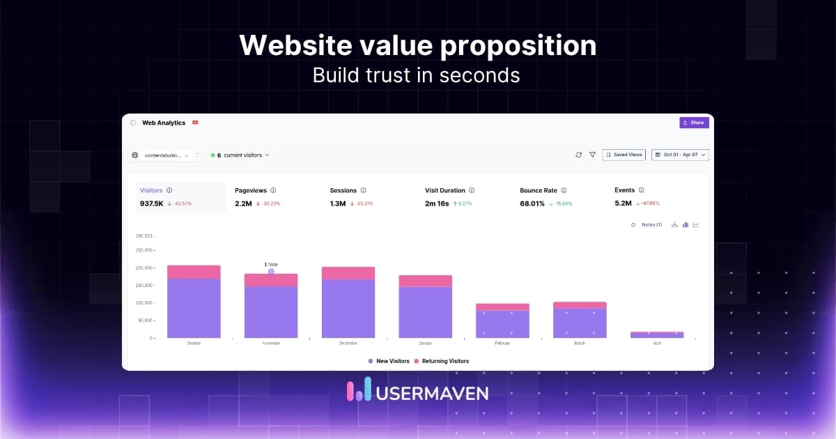
2. Analyze user behavior
Your web analytics can tell you a lot about how your value proposition is performing. Look at key website performance metrics like:
If people leave quickly or don’t take action, it often means your message isn’t connecting. Strong messaging should make users stay, explore, and convert.
3. Run A/B tests
Don’t rely on guesswork. Test different versions of your value proposition to see what actually works. You can experiment with:
Different headlines
Different positioning angles
Different benefits
Even small changes in wording can have a big impact on conversions. The goal is to find what resonates most with your audience.
4. Talk to your users
Your best insights come directly from your users. Ask simple questions like:
Why did you choose us?
What problem were you trying to solve?
Pay attention to how they describe your product and their problems. The words they use can help you create clearer and more relatable messaging.
A good example of this approach is Socialplug, a marketplace for buying followers, likes, views, and comments on social media. They operate in a space where trust is a major concern, and customers are often skeptical about quality and results.
Their messaging focuses on what users actually care about: reliability, authenticity, and safe delivery. This makes the value clear and builds trust.
Examples of strong website value propositions
Let’s look at what good looks like.
Example 1: Simple and direct
“Get access to reliable ad accounts without restrictions.”
Why it works:
Clearly explains the core offer
Focuses on a specific problem
Easy to understand at a glance
A brand that does this well is Uproas. Their homepage headline says: “Unlock limitless advertising with whitelisted agency ad accounts.”
This works because it directly communicates what they offer, access to ad accounts, and removes a major pain point for their audience. The message is clear and immediate, especially for users dealing with account restrictions.
Example 2: Audience-focused
“Create high-quality blog content for teams that want better SEO results.”
Why it works:
Clearly defines the audience
Focuses on a specific goal
Feels relevant to the right users
ContentPen.ai is a strong example of this. Their headline says: “Generate blogs that increase organic traffic and get cited by AI.”
This works because it speaks directly to content marketers and teams focused on growth. It highlights outcomes they care about, traffic, and visibility while also tapping into a modern need: getting recognized by AI systems.
Example 3: Outcome-driven
“Save more money and improve cash flow from your investments.”
Why it works:
Focuses on the end result
Easy to understand
Connects with a strong user goal
R.E. Cost Seg uses this approach very effectively. Their headline says: “Lower your taxes and increase cash flow.”
This works because it focuses entirely on the outcome. Instead of explaining the technical details of cost segregation, it highlights the result that matters most to real estate owners. The value is immediately clear, even for someone unfamiliar with the service.
Measure and enhance your website value proposition with Usermaven
Writing a value proposition is one thing. Knowing if it actually works is another.
Your value proposition directly affects how users behave on your website, and that’s something you can measure with the right data. Usermaven helps you track and understand this behavior, so you can see whether your messaging is clear, relevant, and driving results.
See how users respond to your messaging
When users land on your homepage, their behavior shows whether your message is clear.
Website analytics tool for modern marketers & agencies
*No credit card required
Final thoughts!
Your website value proposition is often the first impression users have of your product. If it’s clear and easy to understand, people stay, explore, and take action. If it’s confusing, they leave, no matter how good your product is.
The key is to keep things simple. Focus on what you do, who it’s for, and why it matters. Avoid trying to sound clever or overly technical. The clearer your message, the easier it is for users to connect with it.
And remember, this is not a one-time task. Your value proposition should evolve as your product and audience change.
Keep testing, refining, and improving it so it continues to resonate and drive results.
Frequently asked questions
1. Why do I need a value proposition for my website or brand?
A value proposition helps people quickly understand what you do and why it matters. Without it, visitors may feel confused and leave your website. It gives direction to your messaging and helps you stand out in a crowded market. A clear value proposition also improves engagement and increases the chances of conversions.
2. Where should your value proposition appear on your website?
Your value proposition should be visible wherever users first interact with your site. Common places include: • Homepage (especially above the fold) • Landing pages • Product or feature pages The goal is to make sure users understand your value without needing to search for it.
3. What makes a strong website value proposition?
A strong value proposition is simple, clear, and relevant. It should explain what you do, who it’s for, and why it’s useful. It should avoid vague language and focus on real benefits. The best ones are easy to understand in seconds and make users feel like the product is meant for them.
4. How your value proposition impacts conversions
Your value proposition plays a direct role in whether users take action or leave. When users clearly understand your offering, they are more likely to explore further and convert. A weak or unclear message creates confusion, which leads to higher bounce rates and lower conversions.
5. Where to use a value proposition?
A value proposition is not limited to your homepage. It should be used across all key touchpoints. For example: • Website pages • Ads and campaigns • Email messaging • Sales pages Keeping it consistent helps reinforce your message and build trust.
6. Can my value proposition evolve?
Yes, your value proposition should evolve over time. As your product improves, your audience changes, or the market shifts, your messaging should adapt. Regularly reviewing and refining your value proposition ensures it stays relevant and continues to resonate with your users.
A typical SaaS buying journey has nothing to do with the classic seven touches. Today, the environment is so crowded that you need to build trust, stay visible across multiple channels, and show up everywhere your buyers are researching. Most SaaS teams do not have the resources or specialist depth to do all of this […]
Monday morning. The marketing team opens five tools and still cannot agree on last week’s conversions. Google Ads, GA4, Meta Ads Manager, the CRM, and a revenue spreadsheet all show different numbers. The meeting ends with guesses, not decisions. A single source of truth is a shared, authoritative data layer where every important marketing and […]
Sales teams in 2026 have more dashboards, more CRM data, and more reports than ever before. Most of them still cannot answer the question: which activities, channels, and behaviours are actually driving revenue? The problem is not a lack of data. It is a lack of the right measurement system to turn that data into […]