Feature adoption in Usermaven
Feature adoption is a crucial metric that sheds light on the value customers derive from your product’s features. The more value users obtain from these features, the greater their likelihood of remaining loyal to your product.
It serves as a key indicator of feature utilization and becomes even more powerful when integrated with other analytics metrics. By harnessing these insights, you can craft a well-informed feature adoption strategy that not only enhances your product but also assists in developing effective in-app experiences to guide customers throughout their journey.
This document serves as your guide to unlocking the full potential of this tool, enabling you to monitor and analyze user interactions effectively.
Setting up the feature adoption dashboard
Usermaven offers a comprehensive feature adoption dashboard. To access it, go to Product Insights and then select Feature Adoption from the drop-down menu. You’ll then encounter a prompt guiding you through the setup process. Click on the ‘Setup’ button to initiate the configuration.
You will then be prompted to add a new Module—a distinct component similar to a building block, each crafted for a specific function. The Reporting module, for instance, is tailored with features for custom report creation, real-time data analysis, and exporting modules. Each feature within this module acts as a specialized tool to enhance functionality.
Follow these steps on the prompt:
- Module creation : Provide a name and description for your module, defining its purpose and functionality. For example, let’s name it Tracking Users in this instance.
- Feature addition : Add features to your module to track specific functionalities. Enter the feature name and, in the second step, select the events associated with it. You can choose multiple events if needed. For instance, you can create a custom event for ‘User Identify’ and then select the events that define that a link has been created on your platform.
- Feature evaluation Criteria : Define the criteria for feature adoption. A user is marked ‘Adopted’ if the number of events exceeds your specified threshold. Additionally, set criteria for user Retention, whether on a weekly, bi-weekly, or monthly basis. For the example being discussed, you can consider a user adopted if the number of events is greater than 2 and a user retained if they use the feature on a weekly basis.
Tailor these settings to align with your specific needs and preferences. This streamlined process ensures effective tracking of features, providing valuable insights into user adoption and retention.
Group report
Upon returning to the main Feature Adoption page, you’ll encounter insightful data within the Group Report for the previously added features. Let’s delve into the key components:
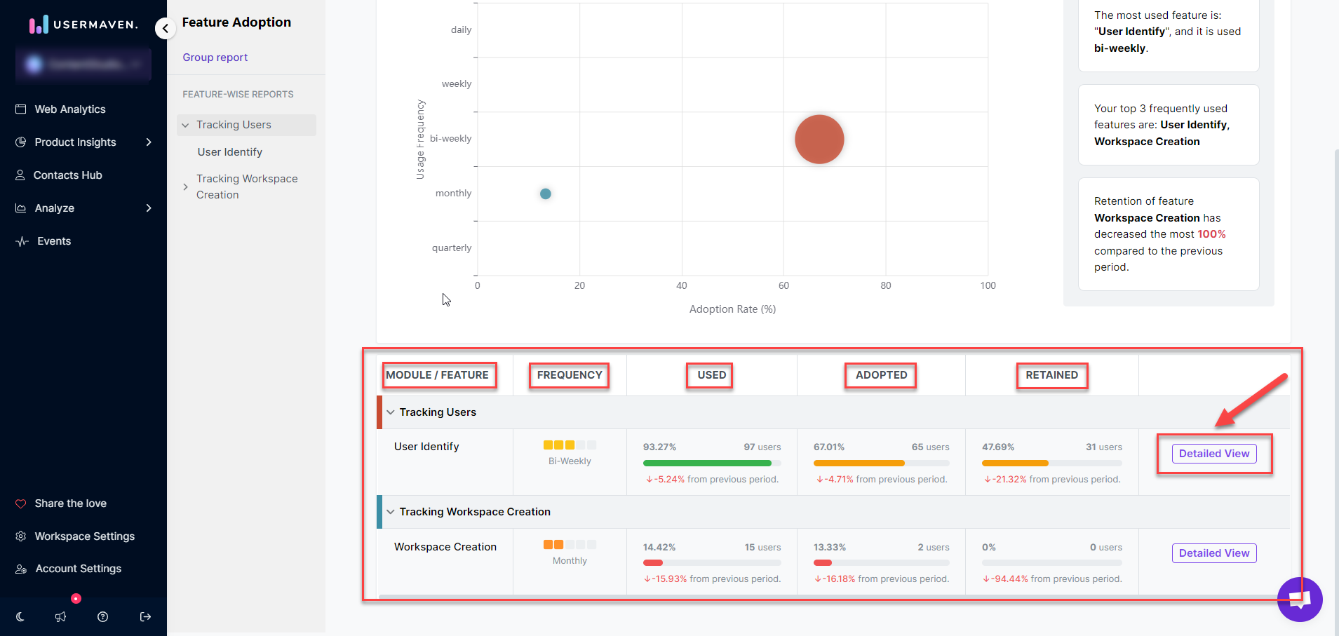
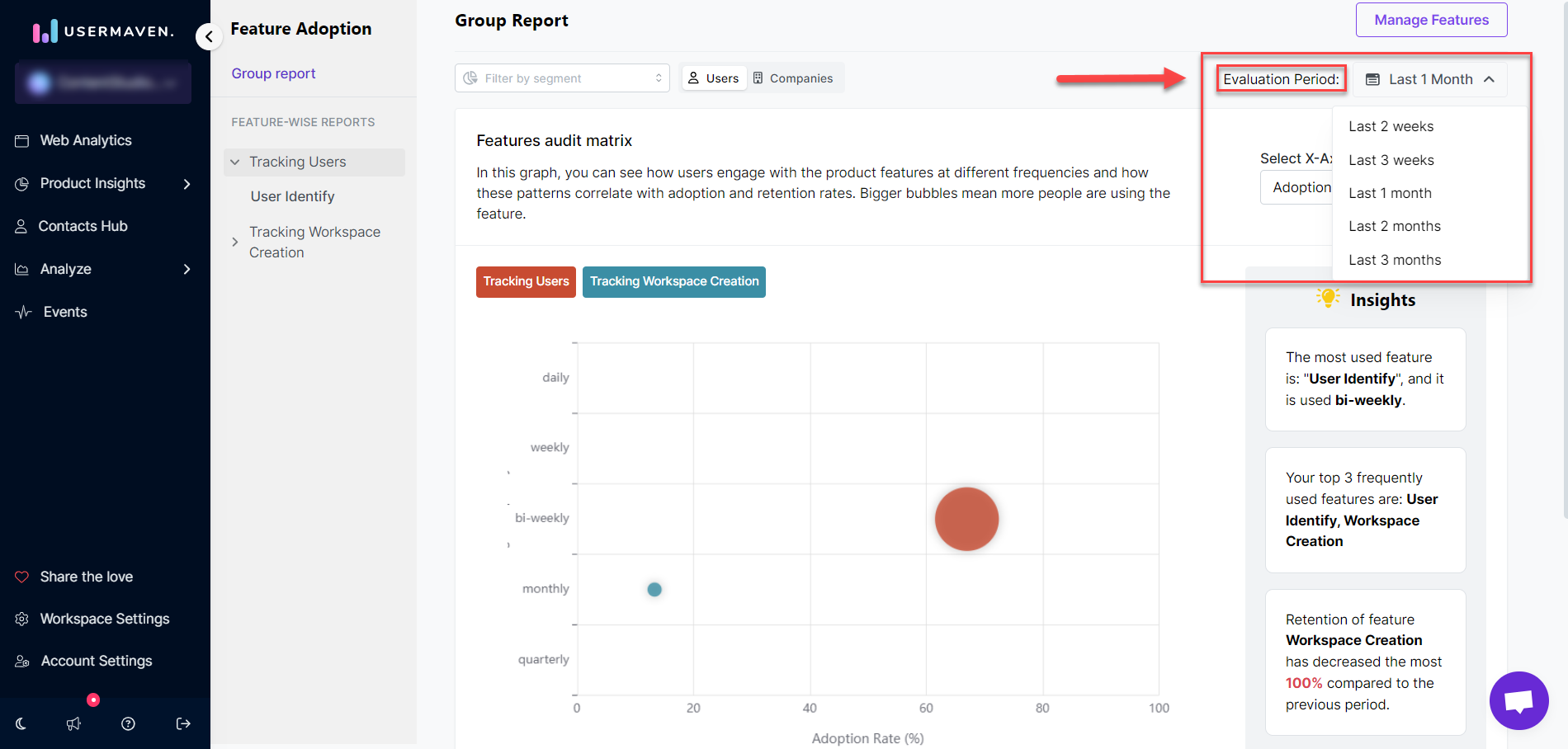
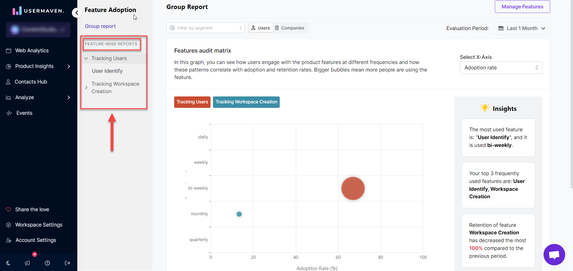
- Features audit matrix : Positioned prominently at the top is the Features Audit Matrix, a graphical representation showcasing how users engage with product features at different frequencies. Larger bubbles indicate increased feature usage.
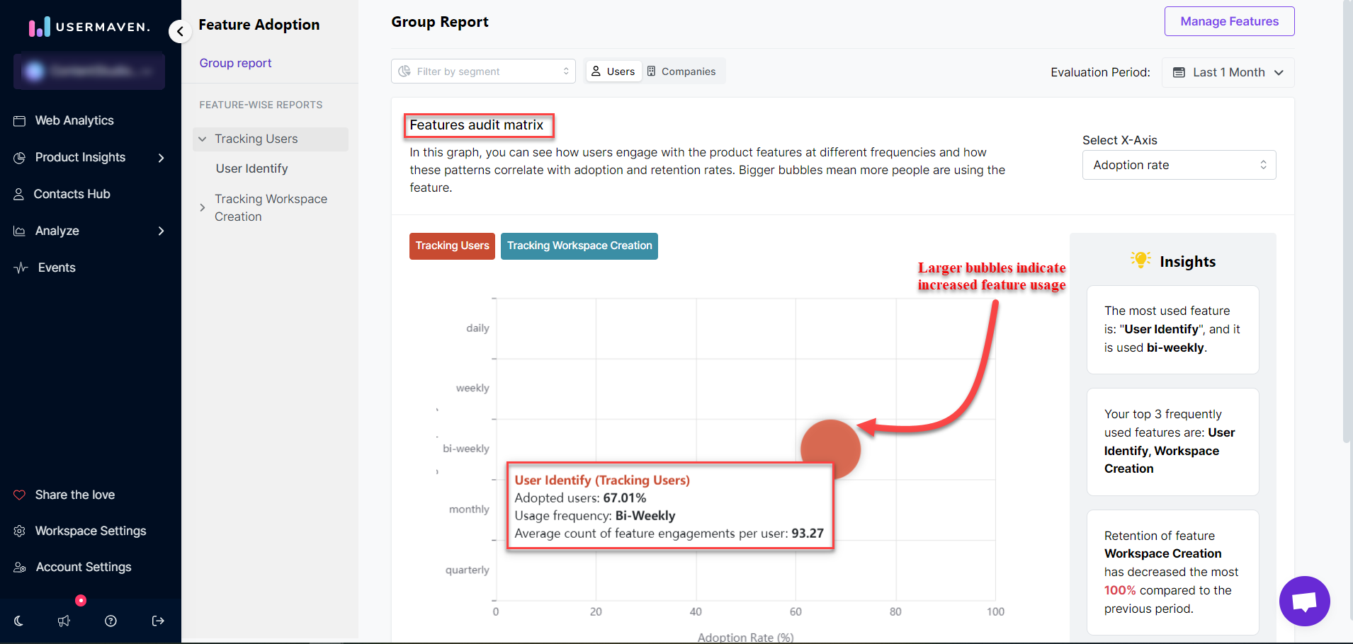
- X-axis selection : On the right side, find the option to select the X-axis. This allows you to choose whether to display adoption or retention rates on the X-axis, tailoring the view to your analytical needs.
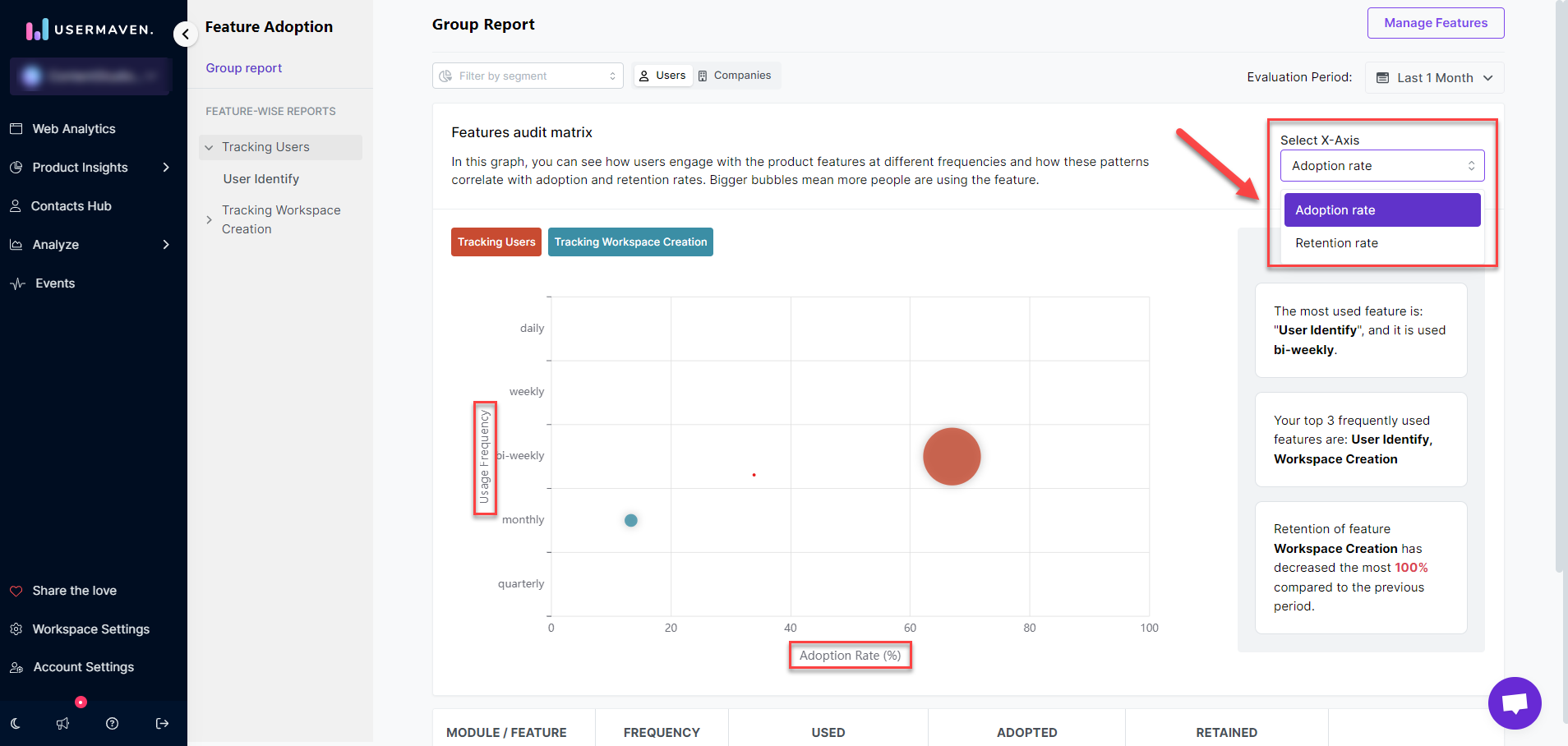
- Comprehensive feature insights : The graph illustrates insights for all created features. If you prefer a customized view with only specific features visible, click on the feature’s name. For example, clicking on the ‘Tracking Links’ tab will mute it, excluding its insights from the graph.
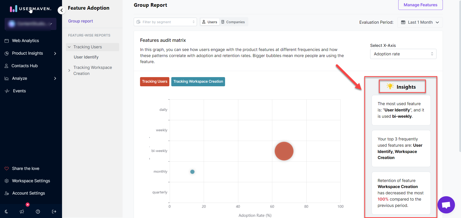
- Detailed insights : Located on the right-hand side of the graph is the Insights tab. This tab provides top insights for your selected feature, offering a succinct summary to guide your analysis.
- Insights table : At the very bottom of the Feature Adoption page, the Insights Table provides a summarized overview. It depicts Module/Feature names, the frequency of usage (e.g., quarterly or monthly), and key metrics like usage, adoption, and retention. This user-friendly interface facilitates a focused exploration of feature adoption patterns, including the number of users, percentage metrics, and changes from the previous period. The table concludes with a tab for a more detailed view.
- Evaluation period : This feature, conveniently positioned in the top right corner, empowers users to align data analysis with specific reporting needs. Select a time range that suits your analysis requirements, ensuring access to the most relevant and up-to-date insights.
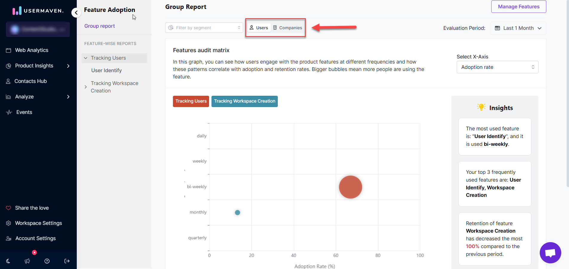
- Data viewing options: Users vs Companies : Users have the flexibility to choose whether they want to view data for users or companies. At the top of the dashboard, an option allows you to specify your preference, catering to diverse reporting needs and perspectives.
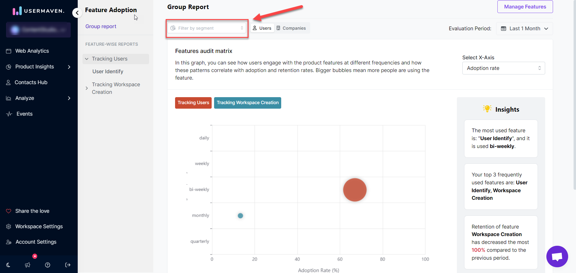
- Segmentation : The Feature Adoption dashboard in Usermaven goes a step further by allowing segmentation of data. Locate the “Filter by Segment” tab at the top right corner to access a variety of segmentation options. Upon selection, Usermaven dynamically tailors the information, facilitating in-depth analysis and insights specific to each segment.
- Feature-wise reports : On the left-hand side, the feature-wise reports section provides easy access to all created modules and features. This feature ensures efficient tracking and management of features, simplifying the navigation process for users.
Detailed view
Upon selecting the Detailed View tab, users gain access to a comprehensive analysis of the selected feature, providing nuanced insights into user engagement and feature performance. The detailed view unfolds as follows:
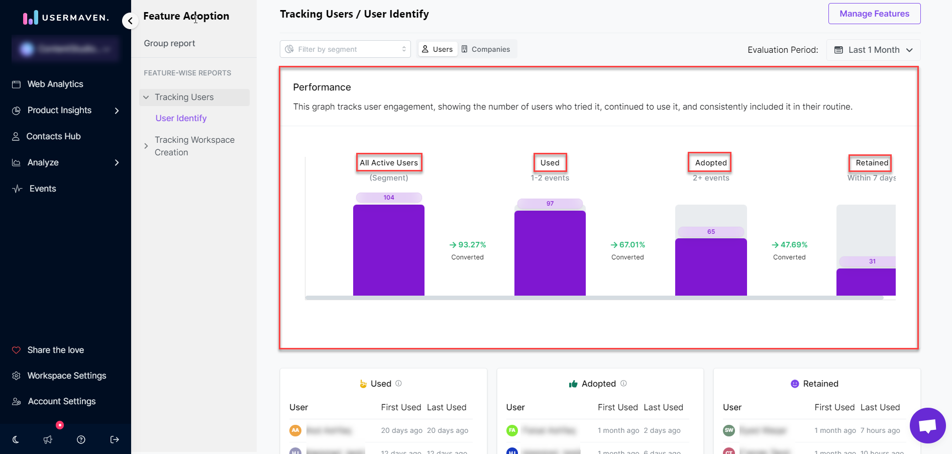
- Performance graph
At the top of the Detailed View, a performance graph takes center stage. This graph serves as a visual representation tracking user engagement over time. It encapsulates three key stages of user interaction:
-
All active users : It represents all users who attempted to perform the step you specified when creating the module, capturing the initial attempts made by the user base.
-
Used : It encompasses users who actively use the feature. These users have gone beyond mere attempts and have actively utilized the feature. This category filters out users who explored the feature but did not progress to actual usage.
-
Adopted : Includes users with the number of events greater than the specified threshold (e.g., 2 events). This category identifies users who have adopted the feature by exceeding a predefined level of engagement. In the given example, users with more than 2 events are considered adopted.
-
Retained : Encompasses users who used the feature on a recurring basis (weekly, bi-weekly, or monthly) as defined during module creation.
- Used, adopted, and retained insights
Positioned below the performance graph are three distinct boxes, each providing insights into different stages of user interaction:
-
Used : Users who have utilized the feature but have not yet reached the adoption stage. This box specifically excludes users in the subsequent Adopted and Retained boxes.
-
Adopted : Users who have adopted the feature but are not yet in the retention phase. This box focuses solely on users who have progressed beyond the initial usage phase but have not achieved consistent retention.
-
Retained : Users who have been retained, indicating consistent and ongoing usage. The retention criteria are customizable based on how it was defined during the feature insight creation.
These insights provide a granular breakdown of user behavior at different points in the feature adoption journey, facilitating a comprehensive understanding of how users interact with and integrate the feature into their routines.
- Feature usage graph
The Feature Usage graph offers a dynamic visualization of data for the number of users, events, and the percentage of active users over time. Tailor the graph to display the number of users who used the feature, the percentage of active users, or the number of events. This flexibility provides valuable insights into user engagement patterns and the feature’s overall impact.
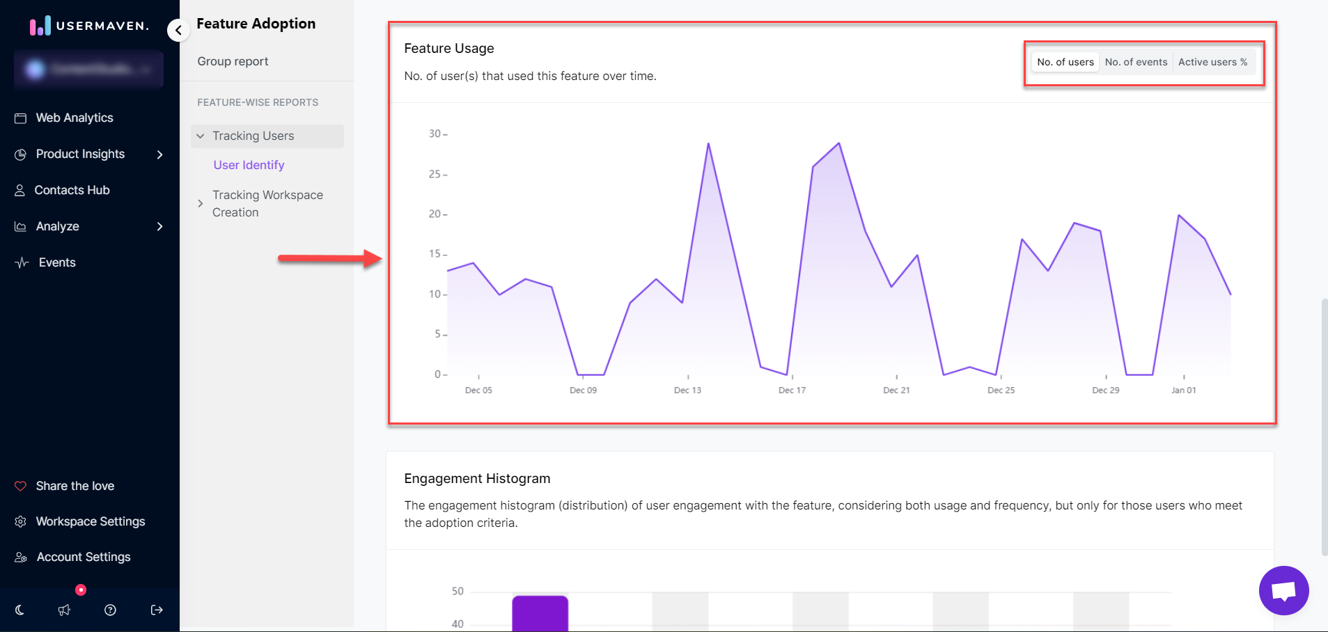
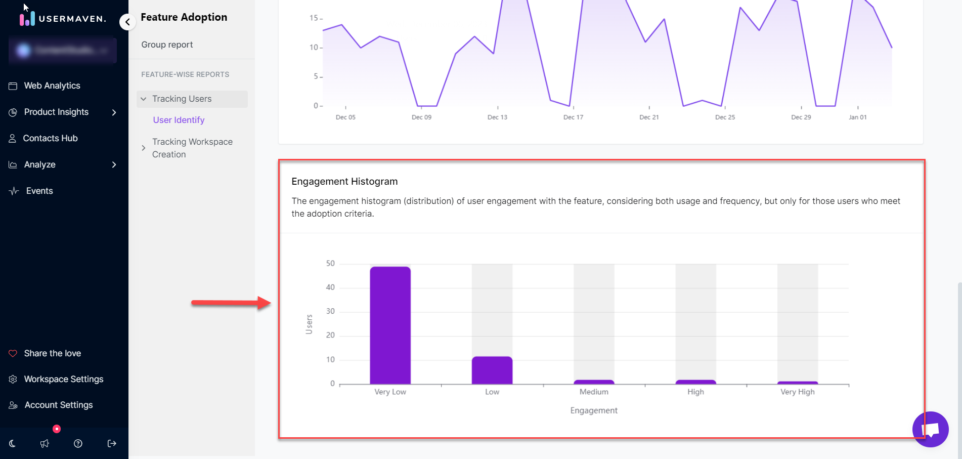
- Engagement histogram
At the very end of the page, the Engagement Histogram portrays the distribution of user engagement, considering both usage and frequency. This histogram specifically targets users who meet the adoption criteria, offering a nuanced perspective on how engaged users are with the feature.